Prompt: Redesign your home town website in a way that is user friendly, accessible, and captures the town identity. Consider how the user will navigate through the website.
I wanted to consider my audience at the forefront of my mind throughout the design process for this site. My hometown, Holliston, MA, is known to have a population of largely older adults, so I prioritized visual accessibility, high contrast values, ease of navigation, and universal imagery throughout my process.
Final Mockup and Home Screen
Above is my final mockup and home screen of my website redesign for Holliston, Massachusetts. My goal for the home screen was to fuse Holliston's primary red from its logo and school identity with that cozy New England fall scenery that so many of us visualize when we think about small New England towns.
Process Work
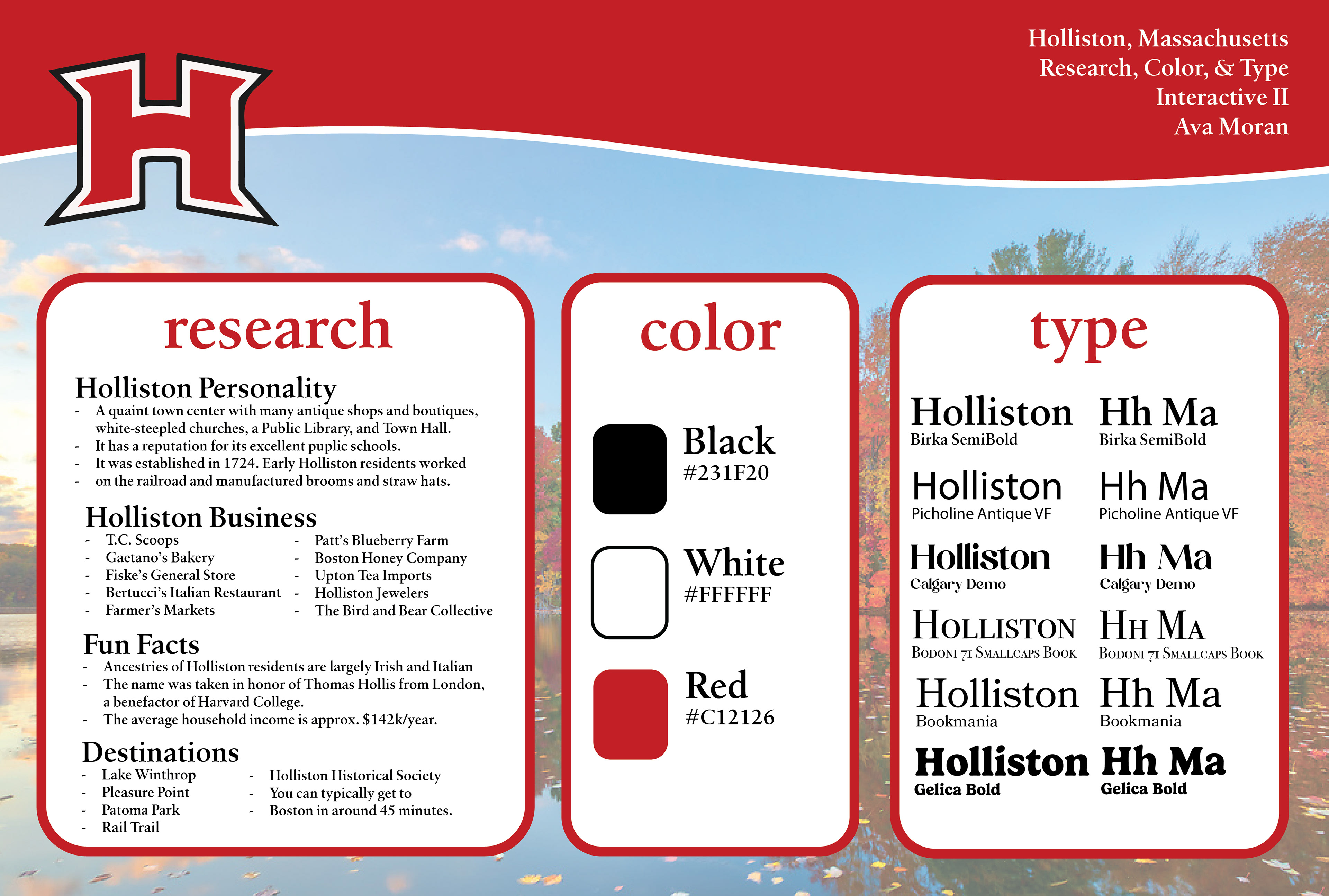


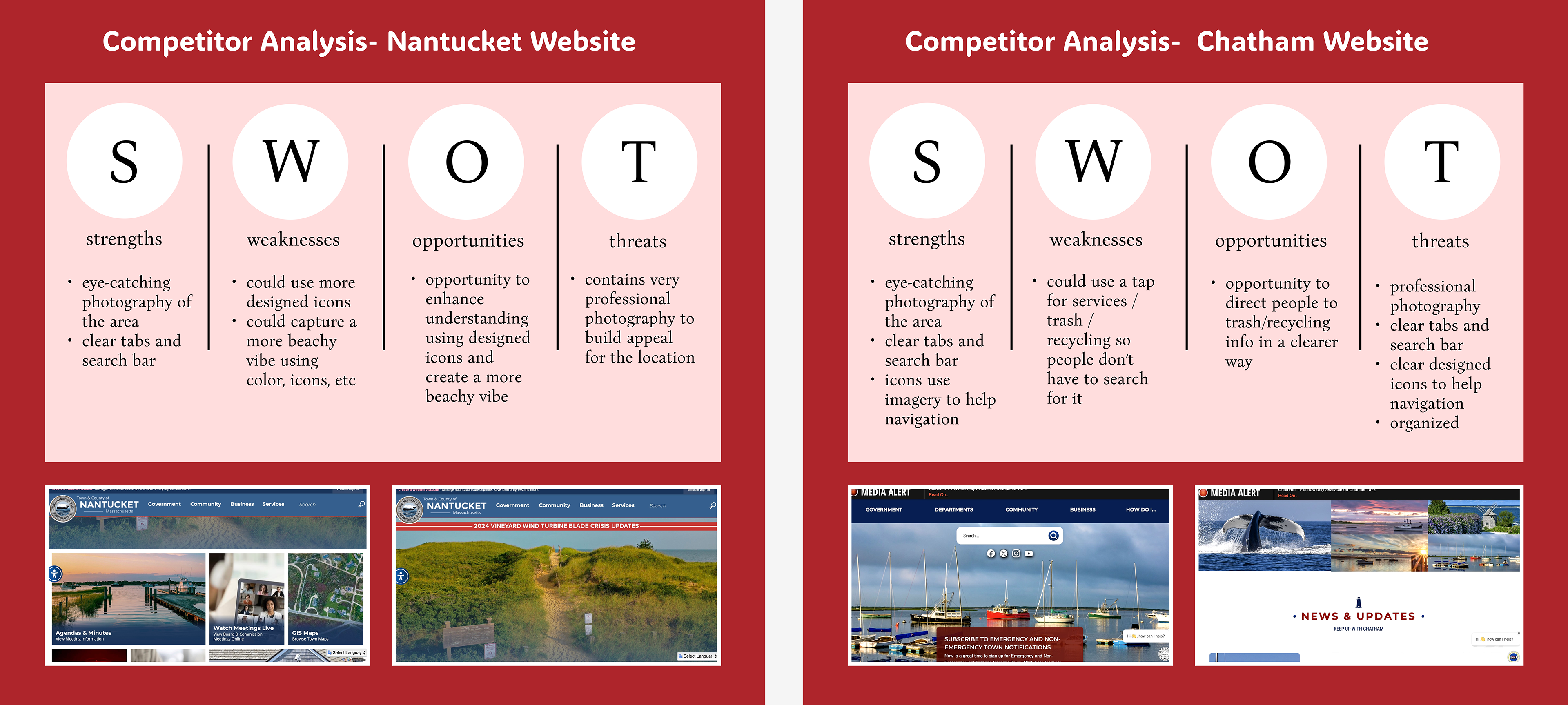
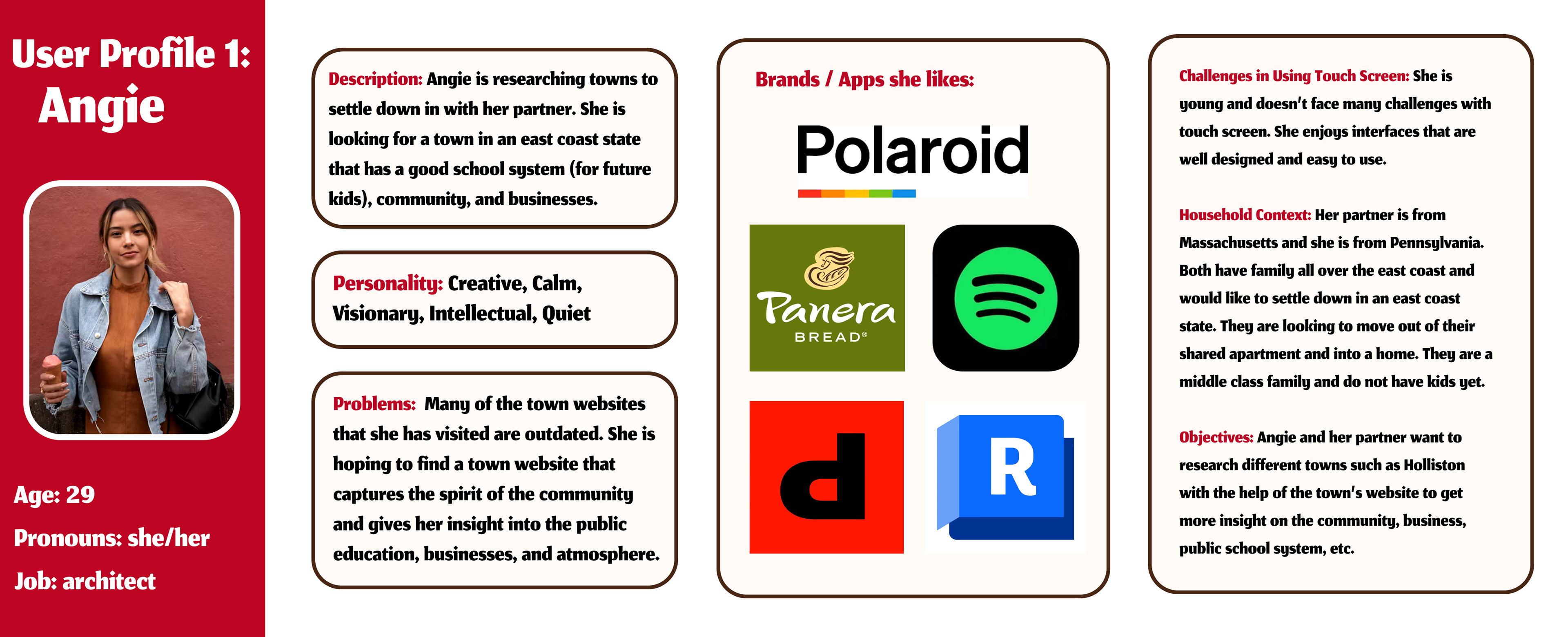
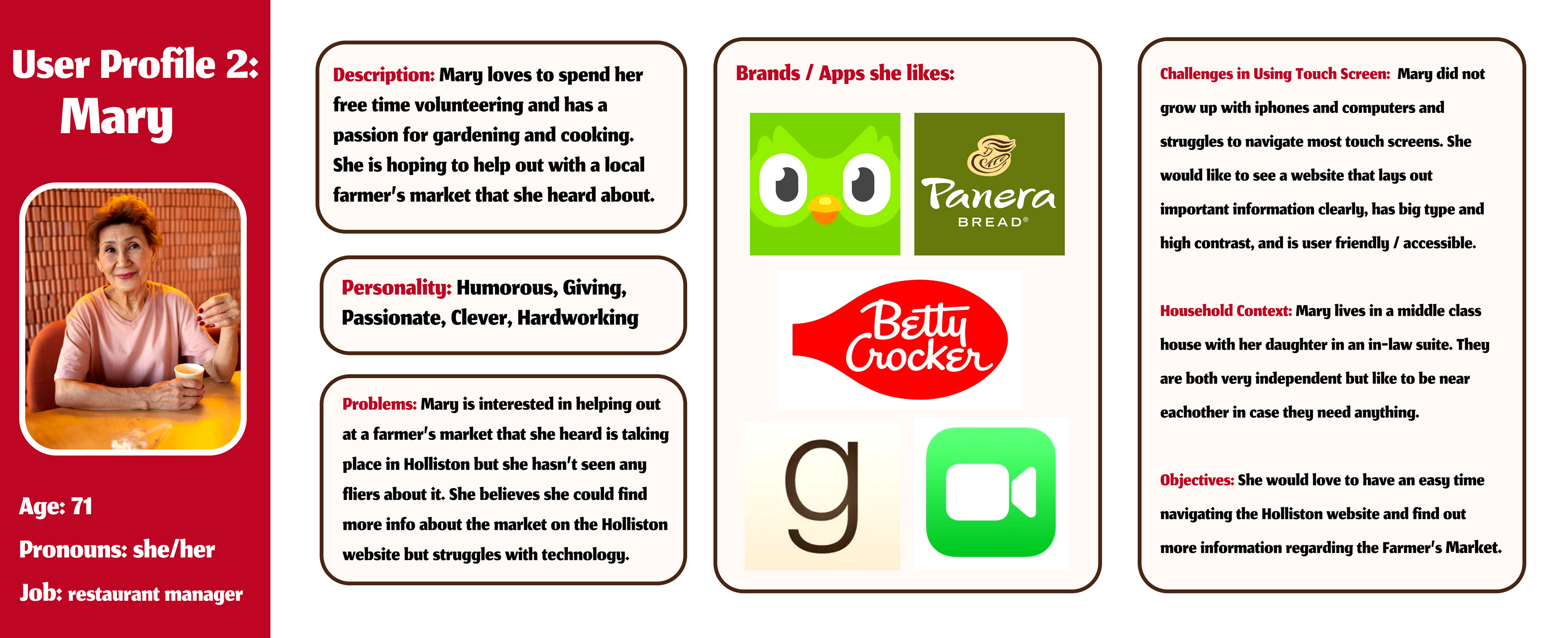
My process can be viewed above, including my initial research, color palette, typeface choices, user personas, competitive analyses, and site map. I examined the pros and cons of my chosen competitors and was able to use these insights to further develop my own website redesign. I also developed my user personas based on figures I see in Holliston, such as a young person looking to settle down and an older adult.
Low Fidelity Wireframes
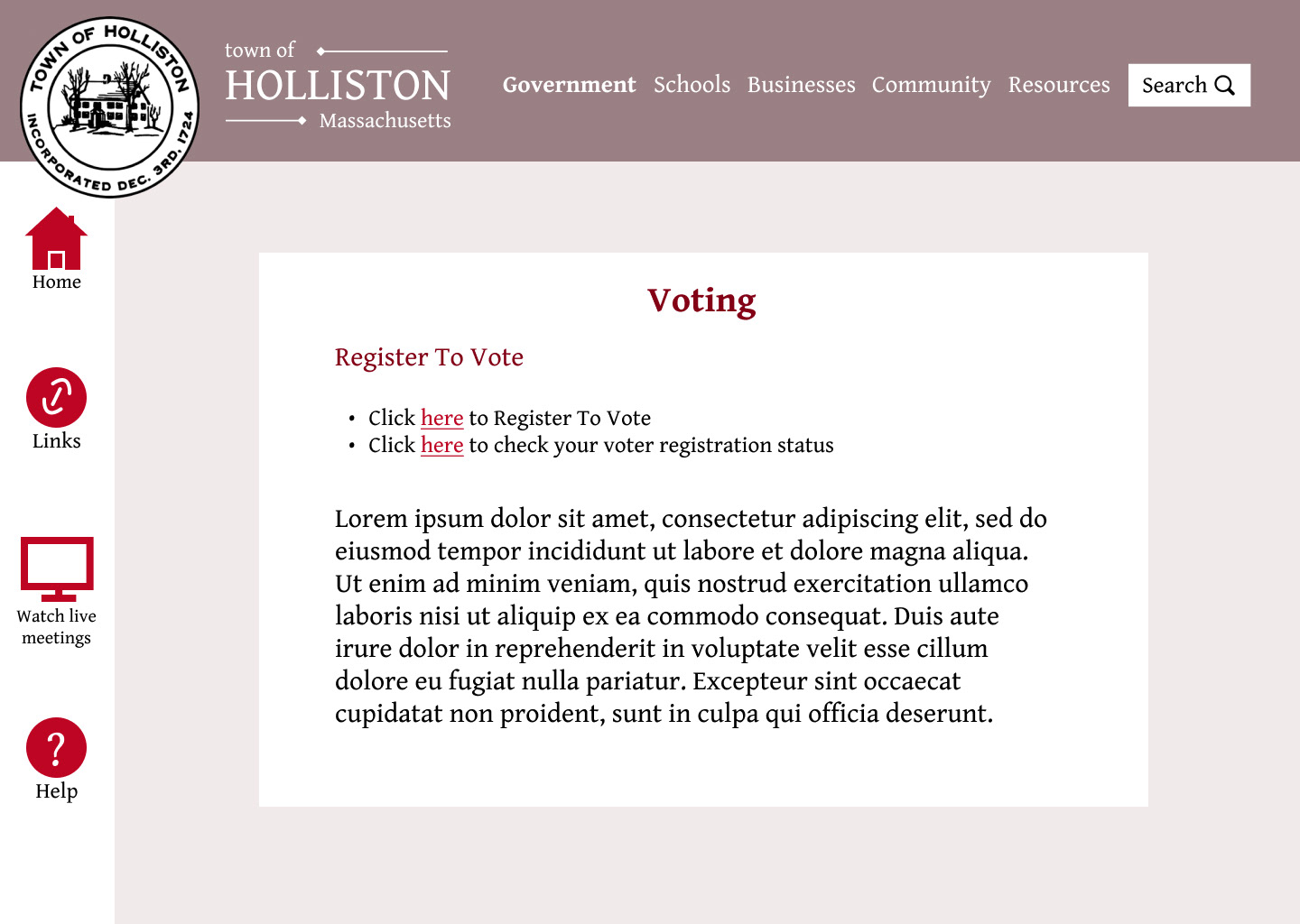
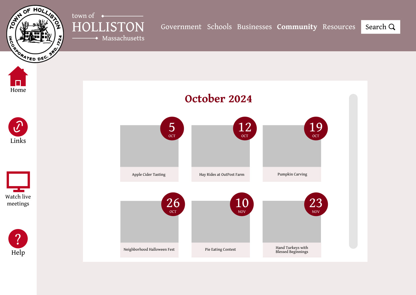
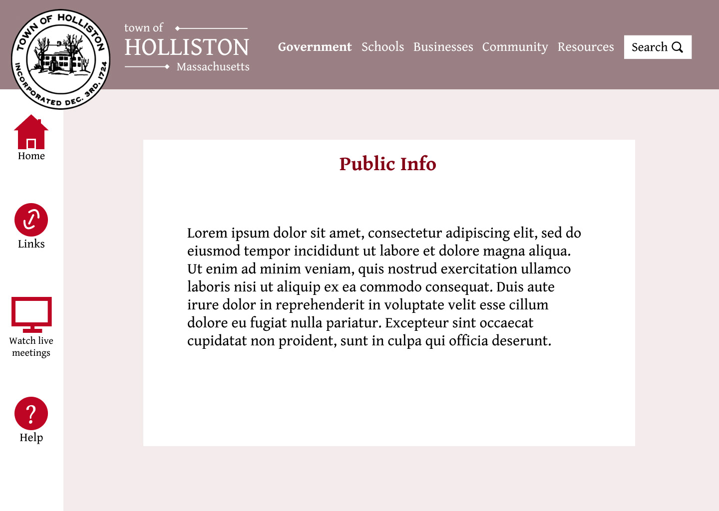
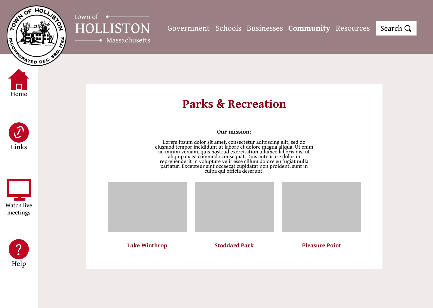
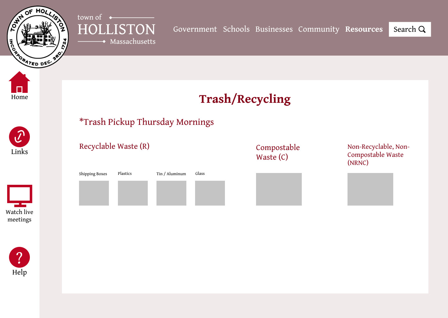
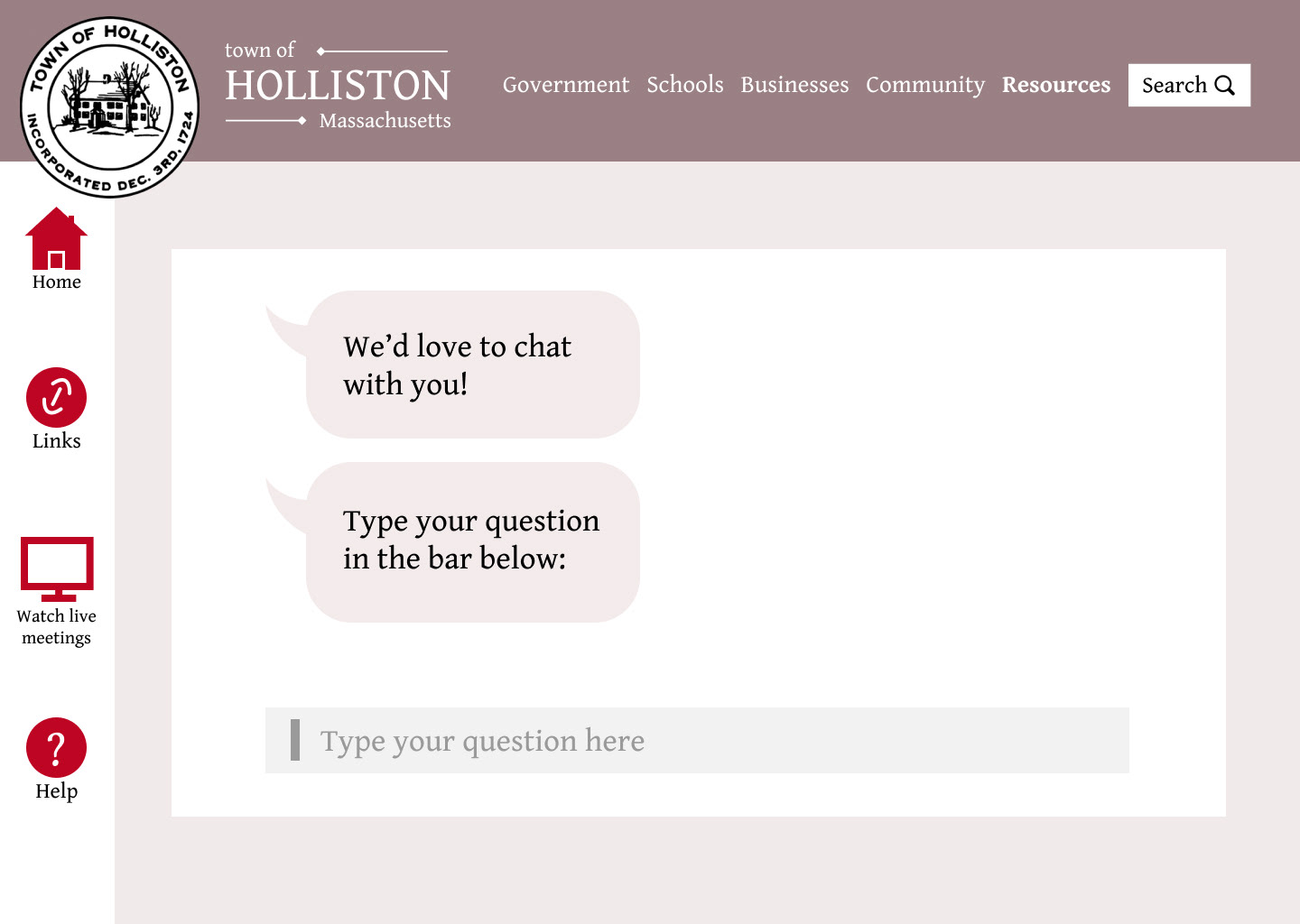
I wanted to include a few of my low fidelity wireframes. I have around 20 in total but I picked a few that I feel give a sense of the navigation and the screen layouts of each of my chosen categories on the top bar (government, schools, businesses, community, and resources. I generally like to create my wireframes in grayscale but with a hint of color to stay consistent with the crucial red of my design. Creating these somewhat detailed low fidelity screens gives me an opportunity to figure out my grid and overall layout without having to think much about photography and imagery yet.
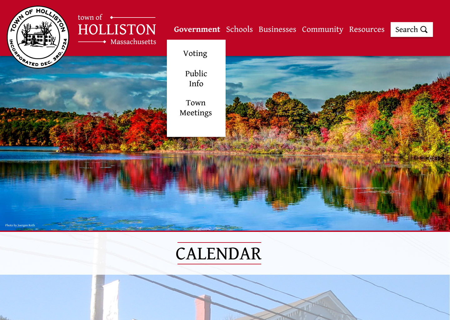
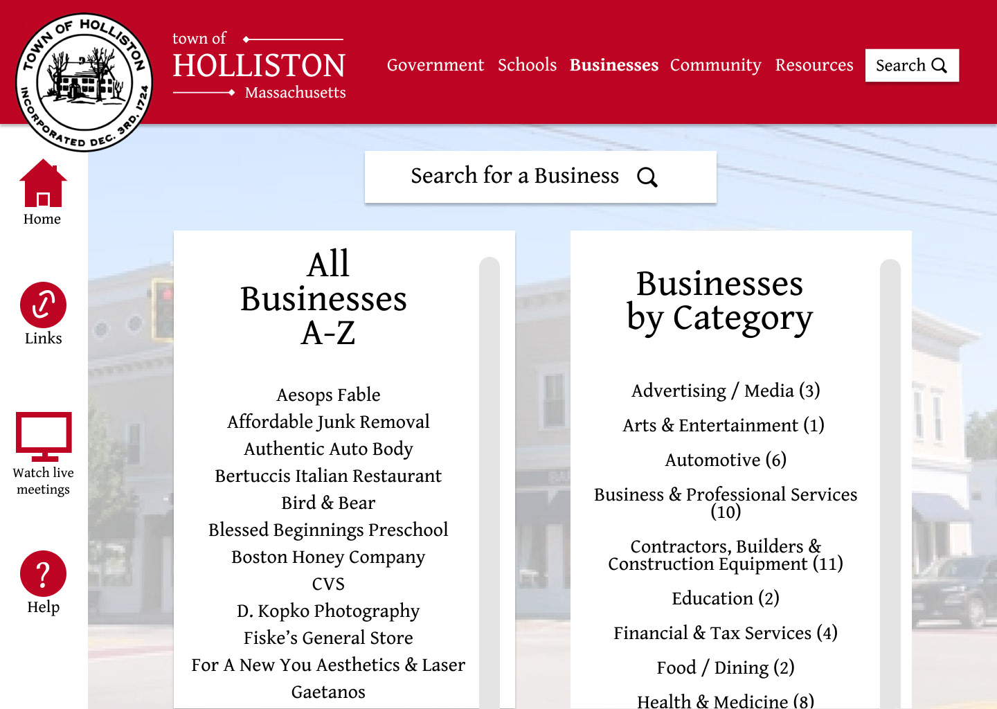
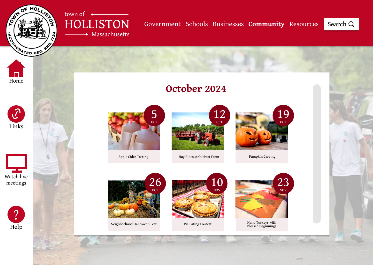
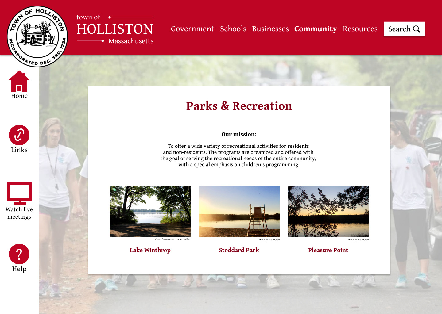
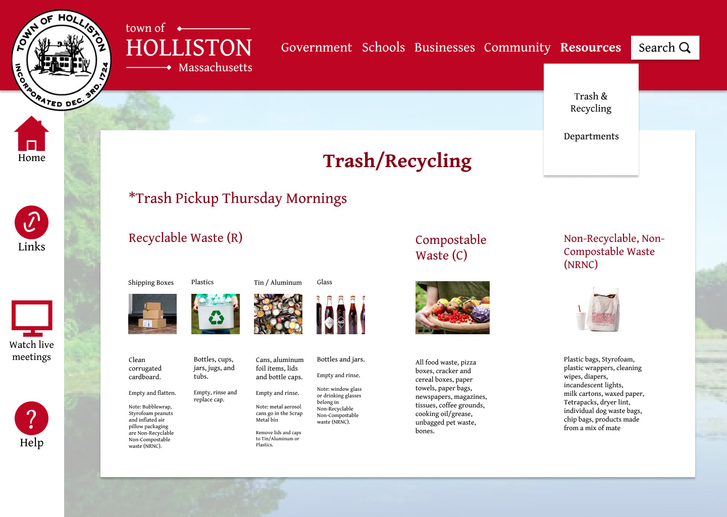
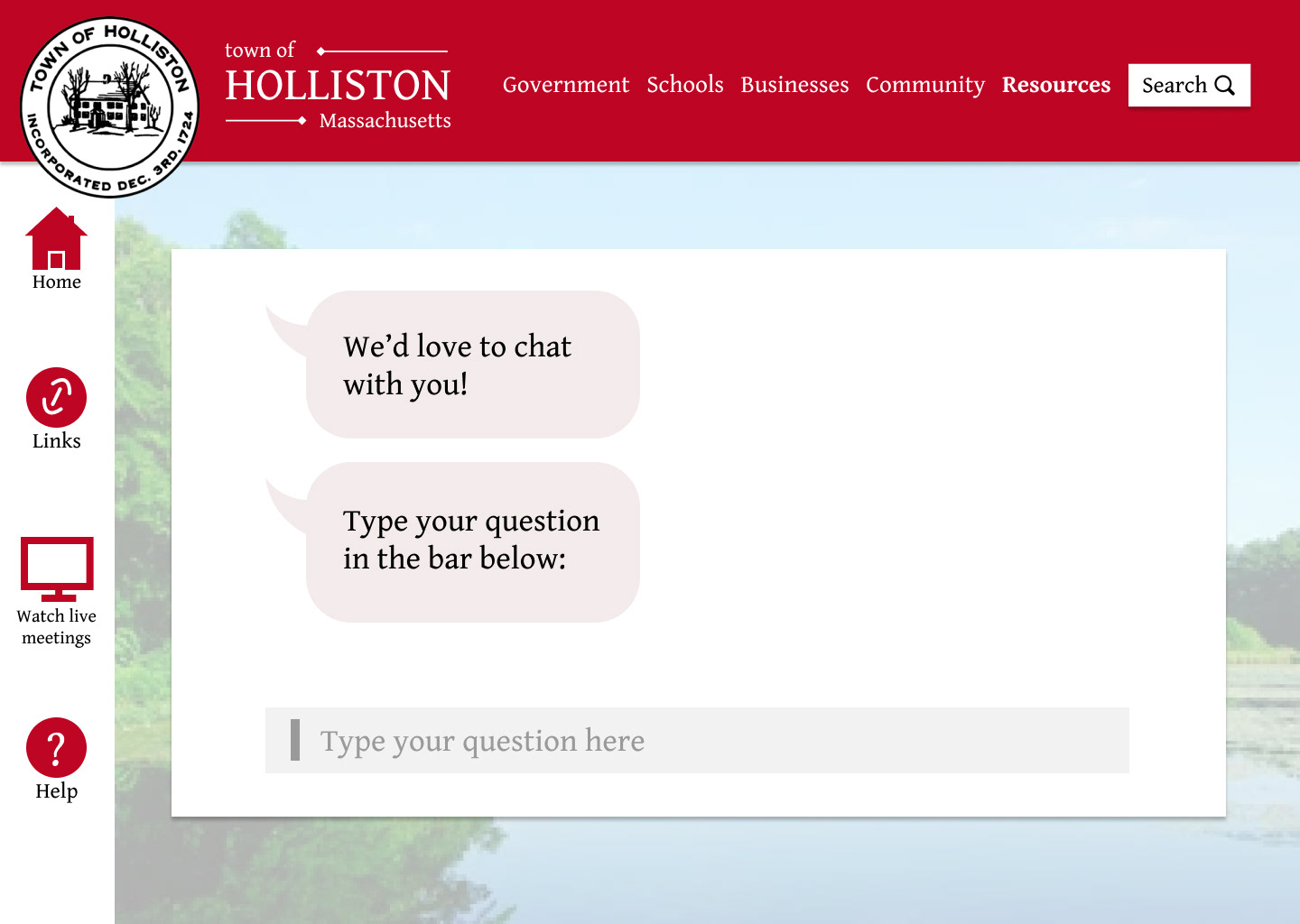
Here are a handful of my high fidelity wireframes so you can get a sense of how my I worked through and rendered my low fidelity wireframes further. My high fidelity frames, in contrast to the low fidelity screens, include the consistent bright red header bar as well as imagery throughout the website to replicate real town sites that include town photography.
Something that I made sure to implement throughout my high fidelity frames is vertical scrolling. I made this decision with accessibility in mind, as many Hollistonians are older adults and may not want to read large bodies of small text. To alleviate this issue, I chose to create vertical scrolling on my screens to still include detailed information without cramming it all onto one small screen. This is a great contrast to the original Holliston website which contains a lot of text at a very small point size, which is not be easily digested by those with eyesight problems.
Accessibility is the same reason that I implemented a lot of black and red on white (in addition to those being the town colors), as these tones stand out well. I checked my site using the AAA and AA accessibility and contrast guidelines.
Final Video
Above is my final video which shows how the user would navigate through my website and displays some of my individual screens. It demonstrates certain effects that the user would encounter when clicking and scrolling through (like images becoming enlarged when the user hovers over them, text becoming bolded, etc) and shows some of the information users would find under each of the categories at the top.
Before and After
